Design
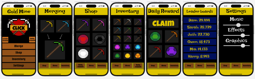
The design of the prototype has gone better than I though however I did run into some issues such as being able to scale the images i have created for this prototype, the images were being imported as much more pixelated than they were supposed to be so i had to re download the images as triple the resolution and add them to the prototype again insuring they work properly. I have decided on this layout as this is a very user friendly step by step layout which couldn’t confuse anyone
Changes
The UI prototype I have built is based off my research and UI wireframing as well as further adjustments to make the app work better for the user such as changing the position of the buttons for the daily reward and leader boards as I think that these pages are not as important and necessary to push for the user as the rest of the pages. They have been changed to smaller buttons and placed above the larger buttons as these will be there if the user ever decided they want to explore that section of the app.
Positives
The areas I think went well are the fact that there is a lot of colour options in the design which break the monotone colours of black and yellow which is the main colour palette I have chosen
Negatives
The areas I could improve on are that I could use softer shapes to create the prototypes as I think this would really smoothen out the overall look of the app as well as an user friendly look and higher quality app
Another area i am not satisfied with is that I could have gone more into depth with each page adding extra options for the player such as different themes and personalisation to make the app feel more user specific, allowing for each user to have their unique style. In the future this will teach me to show every aspect of the game in full by utilizing every section i have been given to show off the app